Entertainment
How Romance Novel Covers Have Evolved Through Time
At the height of his modeling career in the ’80s, Fabio Lanzoni, better known simply as Fabio, says he was shooting up to 10 romance book covers a day. With his long, blonde hair flowing, his shirt unbuttoned or off altogether, and often clutching a woman against his chest, his goal was to be readers’ “fantasy.”
“The world is upside down,” says Fabio, now 65 and living in Los Angeles. “We need more love and romance. You turn on the TV, the news—everything is negative. People need a desperate escape, and a lot of these books, they were giving people fantasy.”
They still are. The desire to escape from reality with a good love story is one of the reasons that romance comprises nearly a quarter of all adult fiction print sales, according to Circana BookScan. Dedicated readers of the genre have long understood that the image on a romance novel’s cover represents a promise of what they’ll find inside.
TIME talked to publishing leaders, art directors, and academics about how the visuals associated with romance novels have evolved over time, from human models in passionate poses to suggestive portraits of fruit to more chaste, cartoonish illustrations. While the tones, color stories, and graphic styles may have evolved over the decades, one thing has remained constant: with this genre, what you see is what you get. The cover of a romance novel sets the expectation of a love story with a guaranteed happy ending.
Here, the major styles of romance novel covers—and some of the genre’s most iNFLuential designs—through the decades.
Early roots in World War II-era novels
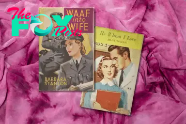
The origins of the modern romance cover can be traced back to the World War II era, coinciding with the rise of mass-market pulp paperbacks, which featured animated illustrations that were only loosely related to stories inside. Romance novels were different—their covers, often resembling movie posters, featured images that directly connected to the plot. The genre was first popularized in the U.K. during this era, with books like Barbara Stanton’s 1943 wartime romance W.A.A.F. Into Wife, the cover of which featured a woman in uniform being longingly stared at by a pilot. With the creation of the National Health Service in the late 1940s, medical romances were also a hot subgenre, and the doctors and nurses in those stories were reflected on the covers of their books.
Around this time, the Canadian publisher Harlequin started reprinting romance books from the U.K. Realizing that romance novels were outperforming their other books, Harlequin decided to ramp up production—laying the groundwork to become one of the biggest romance publishers in North America.
The rise of the clinch cover
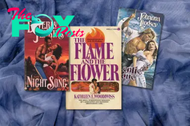
Amid the sexual revolution of the 1960s and 1970s, romance jackets evolved with the culture and became more overtly sexual, according to Jayashree Kamblé, the U.S.-based president of the International Association for the Study of Popular Romance. Enter, the clinch cover: book jackets featuring a couple in a passionate embrace. Kathleen E. Woodiwiss’ 1972 novel The Flame and the Flower, an essential text in the historical romance canon, featured an illustration of a woman in a vulnerable pose, hugged up against a tall, burly man.
With the rise of the clinch cover came the introduction of photographic depictions of a (typically shirtless) hero and a (typically long-haired) heroine in a passionate embrace. The era of the clinch cover was ushered in by publishers like Playboy and Avon, according to Publishing Romance, a 2016 History of the romance book industry by John Markert, and the trend continued through the rest of the 20th century. In the 1980s and 1990s, clinch covers became even more sexualized. “Bodice ripper” is a term that for some became synonymous with the genre, but describes sexually explicit historical romance novels (sometimes with an element of violence).
As women enjoyed more freedom to explore relationships with multiple romantic partners in life, that reality was soon reflected in fiction. More scantily clad men appeared on romance book covers to appeal to female readers, and the stories centered on more female protagonists who had full, complex lives outside of their romantic relationships. “The 1980s and 1990s saw women not only in the larger workforce, but also not just dying to meet a man and settle down,” Markert says. “These are the contemporary romances, and we see women who are divorced or who have to choose between two sexually attractive men, both of whom they might well be having sexual relations with.”
The 1980s and 1990s were also the era of the supermodel, and Fabio became the de facto face of the clinch cover, appearing on jackets for books like Johanna Lindsey’s Tender is the Storm and Gentle Rogue. In 1994, Beverly Jenkins’ Night Song became the first all-Black clinch cover from a major publisher.
Read More: How We Chose the 50 Best Romance Novels
Step-back covers allow for discretion
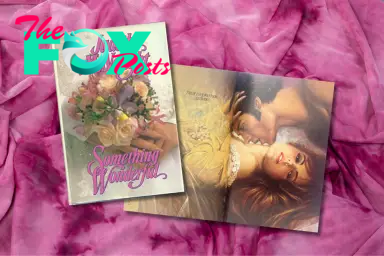
Not everyone wanted to be seen toting a raunchy clinch cover in public, so some publishers started producing “step-back” jackets in the late 1980s and early 1990s to provide some (literal) cover for shyer readers. Popularized by the success of books by authors like Judith McNaught, who wrote historical romance titles like Something Wonderful (1988), step-back covers would typically feature a landscape on the front of the book—but when readers turned the page, they’d find a second, more graphic clinch-type cover.
Sexy single-object photos
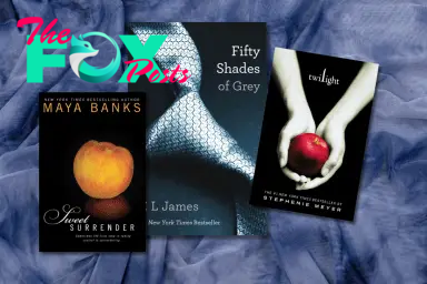
The 2000s proved that sometimes less is more. The designers behind jackets for Stephenie Meyer’s Twilight and E.L. James’ Fifty Shades of Grey series favored single objects under a spotlight against clean, black backgrounds, like an apple or a loosened necktie. The books in Maya Banks’ Sweet series each featured a different juicy fruit, and the choice of which fruit to use was a carefully calibrated decision. Notes Erin Galloway, a publicity director who worked on the Banks books: “We couldn't use a banana.”
Going graphic
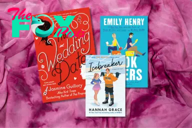
Cartoonish illustrations—friendly, brightly colored, and fairly non-specific images of two people doing non-Scandalous things like sitting at a table, lying on adjacent beach towels, or gently embracing—have become the dominant style for contemporary romance in recent years. One iNFLuential example: Jasmine Guillory’s 2018 debut, The Wedding Date. The silhouettes on the bold, red jacket are a callback to Jane Austen’s Pride and Prejudice—and the overall intent of the illustration was to appeal to consumers who might not think of themselves as romance readers. “Everyone can point to that book as a starting point for this new interest in illustrated covers,” says Cindy Hwang, vice president and editorial director of Berkley, which publishes Guillory and other big-name writers including Emily Henry and Ali Hazelwood. “That did exactly what we had hoped: it caught the eyes of lots of non-traditional romance readers.” (The Wedding Date has sold more than 200,000 copies to date.)
Read More: Romance Novels Are Literature
For the financially challenged publishing industry, commissioning graphic illustrations is also more cost-efficient than producing photoshoots with models. “It was nice that people's interest coincided with a way to save money,” Hwang notes, but she adds that readers had been asking for covers that left more to the imagination, like headless torsos, because they wanted to be able to envision the characters their own way. Age is also a factor—for YA romance novels, which have a wide-ranging readership, publishers have been able to avoid alienating older readers by offering ageless illustrated figures.
But with generalized jacket images comes the risk of an unwelcome surprise for those who don’t want to read extended scenes featuring throbbing body parts. “A lot of people think that the cartoon cover doesn't depict how spicy the content is inside of the actual books,” says Mel Saavedra, founder of Steamy Lit bookstore in Deerfield Beach, Fla.
Bold lettering shouts
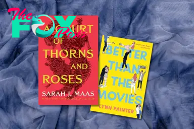
Today, for uber-popular series like Sarah J. Maas’s A Court of Thorns and Roses and Rebecca Yarros’s Fourth Wing (neither of which are traditional entries in the genre, but instead romantasy, which combines elements of both romance and fantasy), big, bold lettering and bright colors dominate. This style is a reflection, in part, of how publishers are constantly comPeting for attention online.
“We definitely want our covers to read well as a small thumbnail on a screen, on TikTok, on Instagram, as well as when it’s printed,” says Sarah Creech, an art director for Simon & Schuster. For example, the designs she supervises for best-selling YA rom-coms by Lynn Painter feature neon block letters spelling out titles that take up virtually all the real estate on the covers. (There’s another specific argument for block lettering beyond aesthetics: “A lot of young readers can't read cursive,” says Liz Casal, who does the cover art for Painter’s books.)
A shift toward inclusivity

Like the rest of the publishing industry, romance books have long been dominated by straight, white, heteronormative, and able-bodied authors telling stories about characters who look like them. But in recent years, a growing number of authors have published books that reflect the diversity of the world we live in. That means book jackets are also becoming more inclusive, allowing readers more opportunities to see themselves reflected on and within romance novels.
-

 Entertainment29m ago
The Smithereens with John Hampson – West Herr Riviera Theatre – North Tonawanda, NY – November 20, 2024
-

 Entertainment5h ago
America On CoffeeWe’re simply inviting you to take a timeout into the rhythmic ambiance of our breakfast, brunch and/or espresso alternatives. We’re comfortable everytime you cease by.Vacation Espresso Cocktail
-

 Entertainment5h ago
12 Methods to Command a Stage
-

 Entertainment5h ago
Beyonce to Headline Halftime Show During NFL Christmas Game
-

 Entertainment7h ago
Did You Correctly Answer This Poughkeepsie Related Jeopardy Question?
-

 Entertainment12h ago
Changes Made in New York to “Men Working” Construction Signs
-

 Entertainment16h ago
Suggestions for delivering a POWERFUL OPENING.
-

 Entertainment16h ago
America On CoffeeWe’re simply inviting you to take a timeout into the rhythmic ambiance of our breakfast, brunch and/or espresso picks. We’re completely happy everytime you cease by.BAD DREAMS – TEDDY SWIMS
