Football
The 20 Premier League badges - ranked
Football is one of the world's best forms of escapism.
But as my new EAFC 24 pro clubs teammates are discovering, I can be one horrible bugger.
When it comes to things like kits or how hard managers are, I am unashamedly ready to rule the roost. Let's rank the 20 Premier League crests, shall we?
Sorry if you don't agree, and sorry if I don't care.
20. West Ham United

Up first, we have Red Bull Stratford.
'London'? Are you having a laugh? Get a life, West Ham. You make me sick.
19. Bournemouth

Hi Bournemouth. Atalanta called. They want their shampoo-brand target man back. For your sake, I say let them have it.
18. Burnley

Burnley, you really are a strange bunch.
Starting from this season, the club have decided to use an all-claret crest on materials, though not the home kit.
In fairness, such an overhaul makes the jagged PES 6-looking badge a little more palatable. But not by much.
17. Wolverhampton Wanderers

You can't pull the wool over my eyes, Wolves. You can't just use basic shapes to make an image of Wile E. Coyote and expect to get away with it.
16. Chelsea

Blue is the colour.
Football is the game.
The Chelsea badge is an abomination and it makes me feel queasy just to look at and you imagine that Todd Boehly will come up with some giant lion rebrand at some point soon and that might not be popular but hey it might be better than this attempt to recreate a credible logo from when the club first won a league title.
And winning is our aim.
15. Brighton & Hove Albion

Once upon a time, Brighton's nickname was 'the Dolphins'. For some reason, they then decided to scrap that and pledge allegiance to the greatest threat known to man.
Also their badge just looks really bare and a bit too much like the Hollister logo. But it's mainly the flying menace.
14. Fulham

A message from 90min's Tom Gott in the Slack channel upon finding out about this article: "I didn't realise Fulham's badge was letters until about six months ago. Just thought it was some weird arrow."
Did you know what Fulham's badge was meant to mean?
13. Sheffield United
For the most part, circle badges are boring, but there's enough going on here that Sheffield United's isn't a complete and utter disgrace.
What lets them down is that it looks like it hasn't undergone one single change since 1889. A bit of modernisation isn't always a bad thing, lads.
12. Aston Villa
It took me too long to figure out the star on Aston Villa's crest - which has been reinstated after their new one for the 2023/24 season failed to gather much momentum - represents the European Cup in their trophy cabinet.
11. Arsenal

If you didn't use a logo pack on Football Manager from 2009 to 2014, this is what your unlicensed team's crest looked like.
10. Luton Town

If Luton Town removed their name and founding year from their badge, it would skyrocket up this list. Thems the breaks, though, mad Hatters.
9. Manchester United

An iconic shape, an iconic design, an iconic club.
Just don't zoom in on the face of the devil
Don't do it.
8. Manchester City
There's nothing inherently wrong with Manchester City's badge. In fact, it's a pretty faithful modernisation of a classic.
Sadly, they're getting knocked for inspiring a wave of inferior crests that look way too much like theirs.
Why am I punishing Man City themselves for that, you ask? Because it's my list and I said so.
7. Newcastle United

As you can see, Newcastle fans, there is no hint of green on your logo.
Just pointing that out. No reason. Why would there be a reason?
6. Nottingham Forest
Nottingham Forest are living in the 1970s. And, on this sole occasion, I approve of it.
5. Brentford

You know what I said earlier about Man City inspiring loads of crappy knockoffs? Or something like that. I don't know, it was like three whole places ago now.
Brentford are the one club who upgraded on that design. The red is popping. The white is popping. The black is popping. That big fat hecking bee is popping.
4. Everton
Everton somehow stumbled into a masterpiece, which is very unlike them in the 21st century.
Their 2013 rebrand was so hideous that the club were forced into a rethink, settling on this current design.
It's as magnificent as you could probably ask for.
3. Tottenham Hotspur

There is an elegance about Tottenham's crest that is also a hinderance.
It's simply too thin to look imposing up against most other badges, an awkward fit on most graphics. But in isolation, it's glorious.
This is a perfect metaphor for Spurs, actually.
2. Crystal Palace

I have been informed that Crystal Palace's badge featuring a giant eagle attacking the original Crystal Palace building is not to scale.
1. Liverpool
There is so much to appreciate about Liverpool's crest, which is one of the very best across all sport.
The unique shape, the touching elements to significant History, the liver bird that Peter Drury just loves to bring up in his commentary. Gorgeous.
Well done, Liverpool, you are the winners. I hope that makes you very happy. Dear lord, what a sad little life, Liverpool.
READ 90MIN'S PREMIER LEAGUE POWER RANKINGS IN FULL
manual


Max Strus Player Prop Bets: Cavaliers vs. Magic | May 5


Minnesota Twins vs Boston Red Sox Prediction 5-4-24 Picks

NY Yankees vs Detroit Tigers Prediction 5-4-24 Picks


Kentucky Derby (May 4th, 2024)

Anti-Bullying Day (May 4th)


-
 Football50m ago
Liam Scales Signs New Bumper Celtic Contract
-

 Football50m ago
Daizen Maeda Returns to Full Training Ahead of Celtic’s Title-Deciding Clashes
-
 Football1h ago
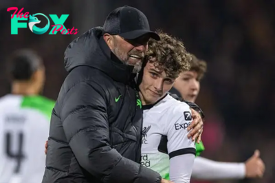
Bobby Clark has played his last game for Jurgen Klopp – season ends early
-
 Football1h ago
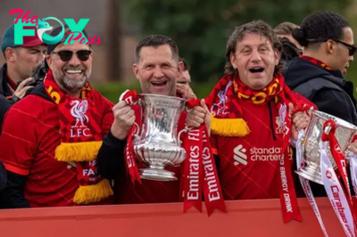
Liverpool coach pens emotional goodbye letter after 15 “unbelievable” years
-
 Football1h ago
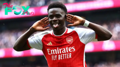
How to watch Arsenal vs. Bournemouth: TV channel, English Premier League live stream info, start time
-

 Football1h ago
Biggest weekend soccer matches: Real Madrid could clinch La Liga, Ipswich Town near Premier League promotion
-
 Football2h ago
Potential 2024/25 Adidas Celtic home kit hits social media
-
 Football2h ago
Liam Scales reacts after signing new long-term Celtic contract