Football
NWSL's Chicago Red Stars to become Chicago Stars Football Club: How the women's soccer team got a new identity
The Chicago Red Stars will officially be part of the NWSL's past as the club will now operate under a new name and iconography for the upcoming 2025 season --- meet Chicago Stars Football Club. The franchise will adapt the new identity following the conclusion of the 2024 playoffs after utilizing Red Stars for nearly 20 years.
"As the stewards of this club, Laura Ricketts, the ownership group, and the leadership team believe it is time to evolve our identity as a symbol of this new chapter," said Karen Leetzow, Chicago Stars FC president. "It is our intent going forward to honor the legacy made by past players, fans and associates, while carving a new path for the club and representing Chicago more authentically on and off the pitch."
When the NWSL launched in 2013, the Red Stars were one of the founding clubs with ties to the WPS, the NWSL's predecessor. The organization recently celebrated one year of new ownership in NWSL with Ricketts -- MLB's Chicago Cubs co-owner -- and her investor group. They will compete with the original Red Stars crest and name for the remainder of the regular season and through playoffs until a complete brand changeover takes place for the 2025 season.
Closing a chapter and starting a new book
In 2008, the club developed a fan vote contest to name Chicago's next women's pro soccer franchise. Other names in contention were Progress, Towers, Union, and Blues, but in the end Red Stars earned the most votes and former stakeholders upheld the moniker using imaging and colors that mirrored Chicago's municipal flag. The colors and branding were upheld through the WPS era and the early seasons of NWSL before going through a logo refresh in 2017 that kept the same Chicago flag motif in club branding.
Following the 2021 season, the franchise was embroiled in controversy, as the league conducted widespread investigations into allegations of abuse by former head coaches and the failure of player protections by club and league executives which fostered unsafe environments. Previous Red Stars ownership and their former coach were mentioned numerous times throughout multiple investigations, which led to several sanctions. A fine of $1.5 million was issued, and the league dedicated itself to upholding a previous commitment by former ownership to sell the club.
In year one of new leadership, with Ricketts at the forefront, the club hired a new president, head coach, general manager, and chief marketing officer. Landmark contracts for players have been negotiated, and new talents added to the roster. After a last-place finish in 2023 with an eye on a rebuild, the team is now playoff-bound just a year later.
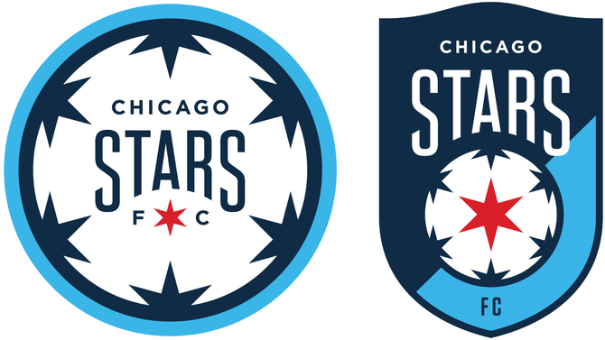
The new rebrand is meant to mark a new era of women's professional soccer in Chicago and honor the club's roots, as they write the next chapter of women's soccer in the Windy City. Stars FC, alongside creative agency Rabe X Birch and Ona Creative, has kept things simple in a new attempt to modernize. Chicago Stars FC still holds signature elements of the City's most iconic symbol -- its flag -- by keeping one singular red star in the center of the crest.
The new star is meant to represent the club's players -- past, present and future. The intent at the Stars' central placement is that players are at the heart of the club and a priority for new ownership.
Along with a fresh crest, there are new colors, secondary logos, and new fonts to ring in the next era. There is a change in the use of blue hues now leaning into navy, instead of black, meant to symbolize the "night sky" and "Great Lake" blues as the background that fills the new Stars FC shield.
For fans who appreciate details, there are more understated elements within the crest. The curved shape on top is meant to favor iconic marquees across the city including the Chicago Theater and historic Wrigley Field. The club recently set an attendance record, 35,038 people, during their "Red Stars Takeover Wrigley" match.
The rebrand story
The Chicago Stars FC makeover has been in the works for several months. Chief Marketing Officer Kay Bradley recently joined the organization in the spring, and while tackling a rebrand wasn't exactly in the job description, it was a responsibility that she was quickly pulled into alongside ownership.
Bradley, who grew up in Maine and spent time in Boston, calls Chicago home after moving to the city several years ago. It's where she met her husband and the two are raising a family in the area. Like many others affiliated with the organization, she understands there's an attachment to the civic symbols of the city and its connection to the club.
"[The rebrand] was something that Laura [Ricketts] had hoped to accomplish early on. I think it was something that she felt would be important at some point to tackle, to demonstrate outwardly the changes in the vision that she had for the club happening behind the scenes, and an outward expression of her mission and her values," Bradley said on the beginning of the rebranding process.
"But it's not a massive revolution from where we've been. It's really evolution. And our intent was to pull through the significant icons that we had in the existing iconography, while also evolving, sharpening, and simplifying and making it feel a bit more modern for the future.
"A lot of intentionality around keeping pieces, not blowing everything up, keeping the elements that we felt were important to carry through, and give a nod to those, while also creating that simplicity, that cleanness of lines in the crest, and finding ways to make it feel modern. Think the other thing we were very cognizant of is making it feel fresh and modern, but also timeless, something that will carry us, hopefully into the future for decades to come."
Along with Stars FC, Bradley has also led marketing campaigns for the U.S. men's and women's national teams. She and U.S. Soccer launched 'Always Possible / Todo es Posible' ahead of the 2023 FIFA Women's World Cup. The campaign represented the many voices of athletes and fans and the mutual relationship of both inspiring each other.
There were similar processes with the development of Chicago Stars FC. The franchise and creative agency held extensive focus groups with supporter group members, season ticket holders, and even newer fans of the club. A crucial aspect was the extensive discussions with Stars players. There were conversations with veteran players and more recent members of the roster to get feedback on cultural components they wanted to keep or incorporate.
Want more coverage of women's soccer? Listen below and make sure to watch Attacking Third on Golazo Network Monday and Friday for all your USWNT, NWSL and WSL women's soccer coverage.
Player input
Over the last year, the franchise has quietly signaled that a rebrand would eventually reveal itself for the club. Shortly after the sale of the franchise to Ricketts' ownership group, there was a significant amount of scale back with the usage of the original crest in imaging through the teams' social media and stadium branding. The slogans or hashtags have not used the word "Red" instead just "ChiStars" or the current implementation of "With The Stars."
Player kits during the 2024 regular season were featured only with a former secondary "C" logo with a red star in the center. The former Red Stars crest is notably absent from any home or away kit this season. Player input on future branding included a desire and emphasis on connectivity with the community, fans, and the city. "Humbled excellence" is some of the paraphrasing used among the players' side.
"There were a couple themes that rose to the top. Specifically, I think that the ethos of the team, and how that parallels the ethos of Chicago, is something that came up time and time again," Bradley shared on the player feedback.
"I think unique to Chicago. It's not flashy, it's not arrogant, it's just -- success, but in a very hard working ... kind of way, and [they] wanted that to be expressed in our brand moving forward. There's also this idea of community and civic pride too, that came up time and time again. Both with our athletes and our fans, of the pride that comes with being a part of Chicago, and also that Chicago has a unique kind of achievement and greatness that's usually accomplished as part of a collaborative and a community, as opposed to the individual.
"And so speaks to the idea that we're all in this together, that our fans are going to show up for us, but we also need to show up for our fans, and this kind of reciprocity of the more that we show up for them, the more that they're going to show up for us, and back and forth. And I love that idea of that we're all in this together, and that we're one, one community, one city, and that we have the ability, when we all come together, to do incredible things."
As the Stars are one of several tenants occupying SeatGeek Stadium in Bridgeview, Ill., Game day operations often entail setting up and breaking down scene-setting branding. Banners, fan tents, other signage, fieldside seating, and theme night activations are part of the efforts to make a leased facility feel like home. New Stars FC stadium imaging will slowly roll out with a celebration on the teams' final match day Nov. 3, with a more official brand launch and changeover for the 2025 season.
Look ahead
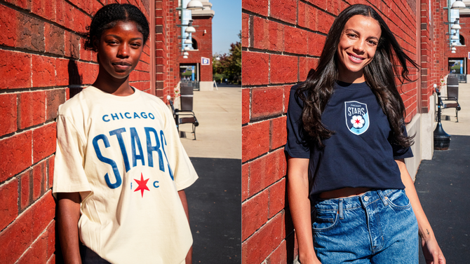
Chicago Stars FC will close out the regular season at home on Nov. 3 against Kansas City Current and release a limited edition capsule collection of newly branded Stars FC items for sale. The club is also a citywide interactive launch by displaying the new logo throughout Chicago's neighborhoods. Fans will have a chance to identify 25 crests within the city for a chance to win two season ticket memberships for the 2025 season.
Playoff positioning is still on the line during the final week of regular season play. Based on final results, Chicago can end up the sixth, seventh, or eighth seed. They will face either Orlando Pride, Washington Spirit, Kansas City Current, or NJ/NY Gotham FC in the NWSL quarterfinals scheduled for the weekend of Nov. 8.
-
 Football4h ago
Report: Celtic’s Lennon Miller Scouting Mission
-

 Football4h ago
Celtic’s Wednesday Night Christmas Tease
-

 Football4h ago
Andy Robertson scores last-minute winner and Ben Doak assists in huge Scotland win
-

 Football4h ago
Big Van Dijk boost & Reds in “negotiations” for Kerkez – Latest Liverpool FC News
-

 Football4h ago
Soccer picks: English Premier League parlay for Saturday 11/23 (+631 odds): Conditions may help Everton get season back on track | Pickswise
-
 Football5h ago
What happens if there’s a tie in the MLS Cup playoffs? Extra time, penalty shootout
-
 Football9h ago
We Need to Talk About Arne Engels
-
 Football9h ago
Arne Engels Social Media Message Ahead of Celtic Return
